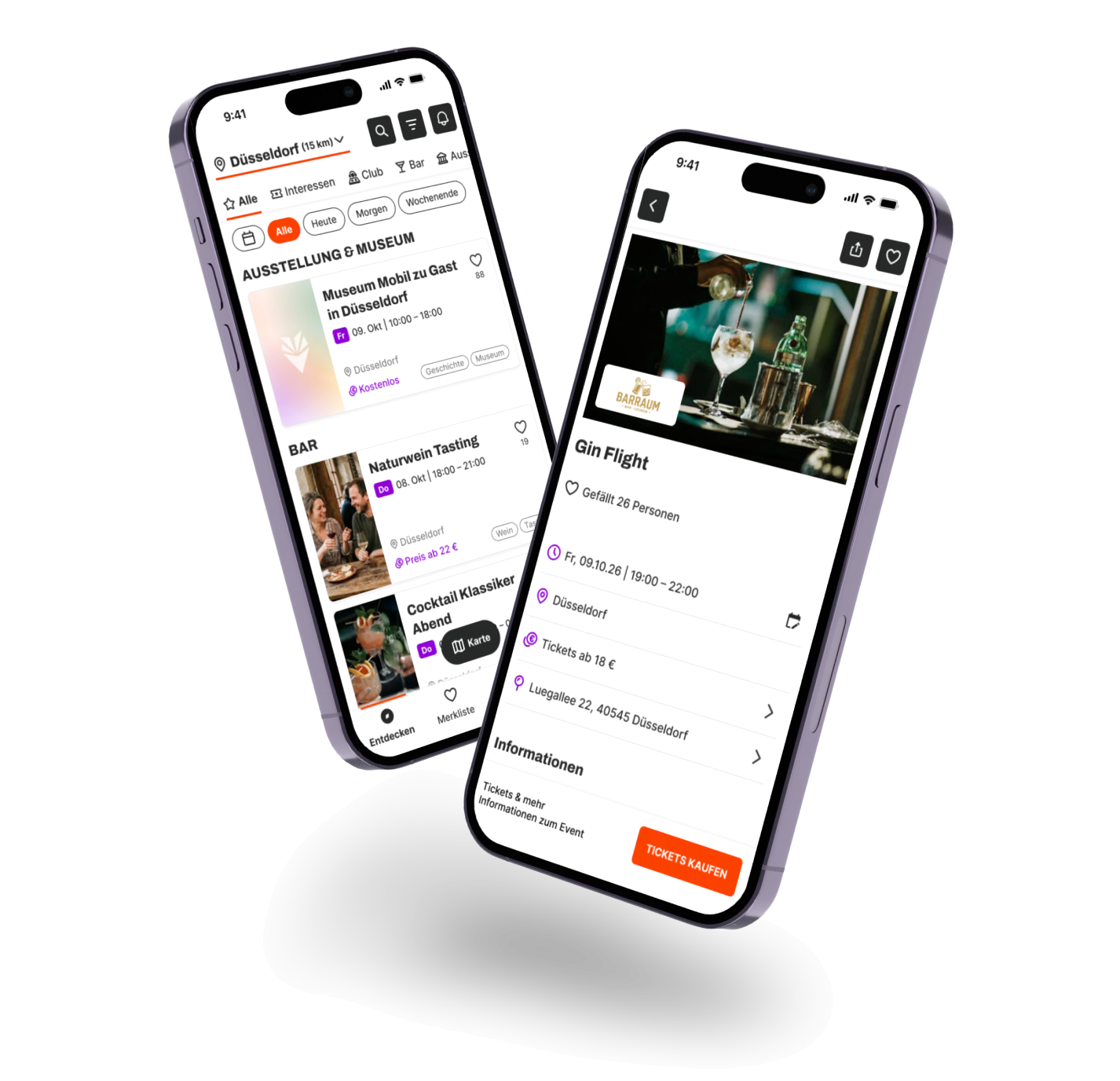

Solo product design case · 2026 · bootcamp project at Digitale Leute
Finding local events easily, clearly and all in one place.
In this case study I show how I used research, AI and UX methods to narrow a broad starting topic step by step into a clear problem statement, and then developed a user-centred solution for it.
- Role:
- Solo product designer
- Duration:
- 4 months
- Tools:
- Figma, Miro, Claude, Google Forms
- Research:
- 4 interviews · survey · 2 moderated usability tests
Problem
Starting question
Do people struggle to get local, everyday information? That covered bin collection, parking and public toilets as well as events.
Focused problem
People who want to do something spontaneous nearby can only find local events with a lot of effort. Searching across different channels takes time and is frustrating.
Note
“Events” is used here as an umbrella term. It covers happenings and activities that take place locally, in your own area.
Research & insights
Four steps from the broad starting question to the focused problem: desk research, interviews, a survey and clustering.
Step 1: Desk research
Researching local everyday information showed that there are problems in several places. Where they were biggest was still open.
Result: problems confirmed, focus still unclear.
Step 2: Interviews
In four interviews, three people brought up local events on their own. Two of them described specific, recurring problems when searching.
Result: a possible shift to events, to be checked with a survey.
Step 3: Survey
To check the direction from the interviews, I ran an online survey with 27 participants. Five sections moved from general search behaviour through difficulties with local topics to events specifically. Anyone who had no difficulties or didn’t look for events was filtered out first, so only the 17 event seekers answered the event questions. Beforehand, I set hypotheses with target values to measure the results against.
Result: the shift is confirmed: focus on local events.
- 65 %
- name events as the topic where information is hardest to find
- 64.7 %
- often or always check several channels
- 90 %
- find hard-to-find information somewhat or very frustrating
Step 4: Where is the problem?Method applied – affinity mapping
To find out where the core of the problem lies with events, I clustered all the findings from desk research, interviews and the survey. Three areas emerged:
- Information quality
- Time-consuming search paths (prioritised)
- Orientation
Prioritised problem areaTime-consuming search paths
Events are spread across many separate websites and channels. Every site is built differently, which quickly gets overwhelming, and you have to find your bearings again each time. Unclear details mean extra searches. That takes time and was described as frustrating more than once.
This problem area also tackles the root cause. A lack of orientation and doubts about information quality mostly come from everything being scattered. Simplifying the search path also solves part of the other problems.
“Every extra club website is another step and makes the search a chore.”
Who am I solving this for?
My persona grew out of all the findings and the focused problem area, “time-consuming search paths”.
“With events, there’s no single place where you get the full picture:when, where, what and who’s playing.”
Ideation & concept
From the HMW question I developed three directions that could take the search off Luka’s hands. Each follows its own core logic.
Community feed · core logic: contribute
A local feed where people post events they know about or run themselves, including the small ones.
Catch: Collecting is up to the users. Without posts, the feed stays empty.
Personal assistant · core logic: suggest
An AI assistant that Luka tells in everyday language what he feels like, say “something spontaneous nearby tonight”. It puts together a matching selection.
Catch: A filtered selection instead of an overview. If the suggestion doesn’t fit, the search starts over.
Central platform · core logic: bundle
Bundles all local events in an area in one place, categorised and filterable, from big concerts to a small club night.
Catch: The idea stands or falls on completeness.
Decision
Only the central platform solves Luka’s actual pain point, because it brings the scattered events together. The assistant and the feed can become features of the platform later, not the other way round.
Risky assumption
The overview has to be complete enough for Luka to trust it and give up his usual channels. If it has gaps, he goes back to Instagram and club websites.
The route to completeness
So the focus is on completeness, and with it on how events get into the app in the first place. Lokal Los. combines four routes:
Existing sources · base
pulled together through APIs, scripts and AI.
Organisers · addition
add their own events.
Users · addition
contribute events they know about.
A small team · review
checks and fills the gaps.
How it differs from competitors
I analysed providers such as Eventim, Eventbrite, Rausgegangen, meinestadt and festle. Most of them rely on ticketing, organiser listings or an editorial selection. Small local events without ticket sales or marketing often slip through. Lokal Los. focuses on exactly these events, and on completeness.
The difference isn’t only in how events find their way into the app, though, but also in design decisions based on the research.
Further considerations
It was also important that the app works straight away without a login. Asking people to register the first time they open it would be an unnecessary hurdle.
Without login
- MVP flow
- Save events (stored on the device)
With location sharing
- Distance shown on the event card and the detail page
With login
- Choose interest filters for a personalised event list
- Submit events
- Sync saved events across devices
- Back up settings in the account, e.g. when switching phones
Testing & iteration
Does my solution work?
During the mid-fi phase, I ran a usability test based on the MVP flow.
MVP flow
Method: user story mapping
- Enter location
- Scroll the event list
- Filter the event list
- Check event details
- Go to the external page
- First use – entering a locationThe app saves the location for next time.
- Paid & free events – going to the external pageTickets require switching to the organiser’s page; for more info it’s optional.
The main interaction happens entirely on “Entdecken” (discover).
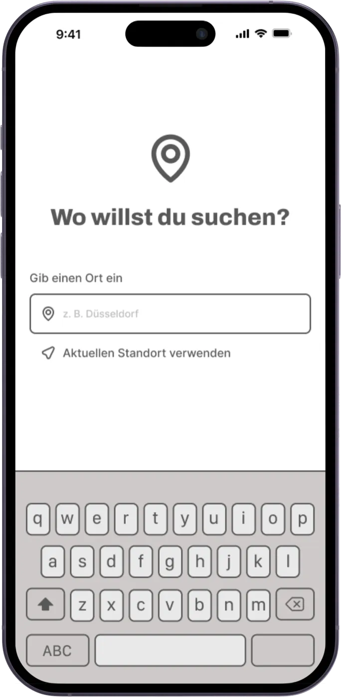
Entry:first use, enter a city 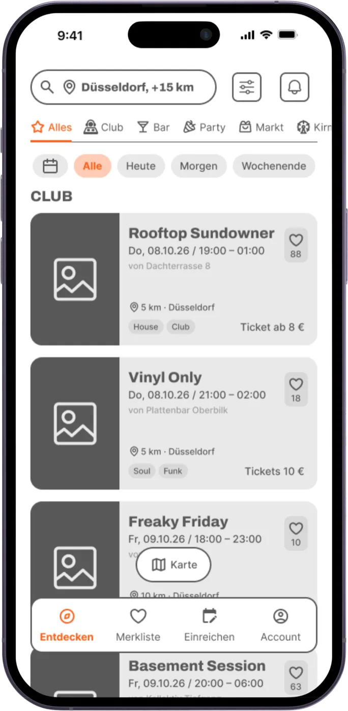
Discover:search, filter and narrow down events 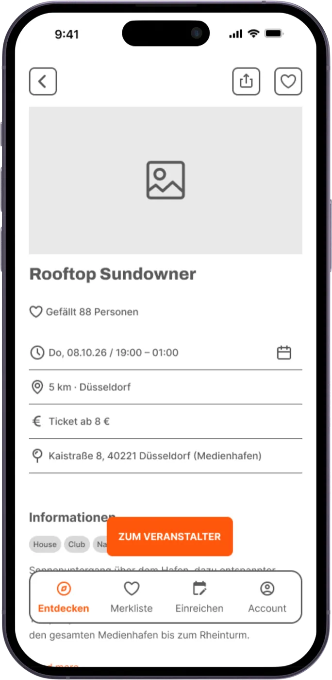
Event details:check the details and go to the external page
Usability test
I tested with two participants.
Problem 1: Event detail page: CTA button, price line & tab bar
- Label: “Zum Veranstalter” (to the organiser) didn’t make clear what people would find there. It matched neither the goal for paid events (buying tickets) nor for free events (more info).
- Price line: Both participants tried to tap the price instead, but it wasn’t clickable.
- Tab bar: The CTA button got lost among the navigation items, and neither participant noticed it straight away.
Changes
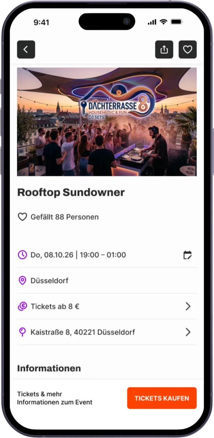 Image · AI-generated
Label: Matched to the action. Paid events: “Tickets kaufen” (buy tickets); free events: “Zur Veranstalterseite” (to the organiser’s page).
Price line: Made tappable, with an arrow that signals the link. That gives a second way to the ticket.
Tab bar: Removed from the event detail page. Only an action bar with the CTA button remains, so it no longer gets lost among the navigation items.
Problem 2: Event data on the event card
- Price & date: The information was there but not visible enough. It got lost in the grey text.
Changes
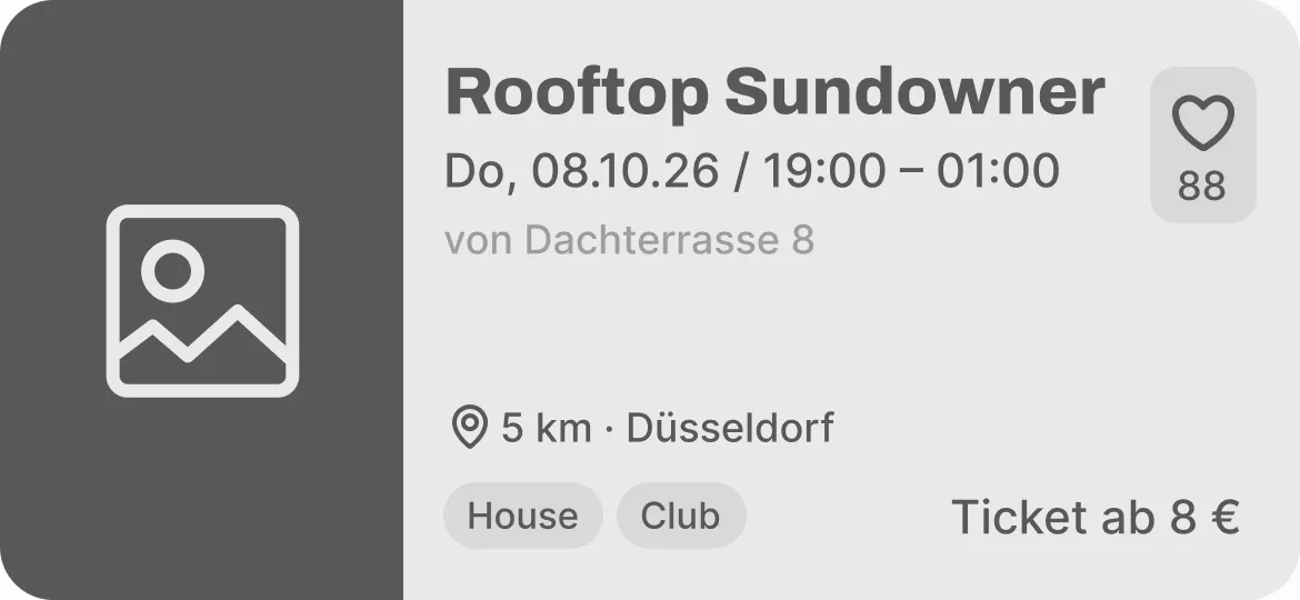
Image · AI-generated
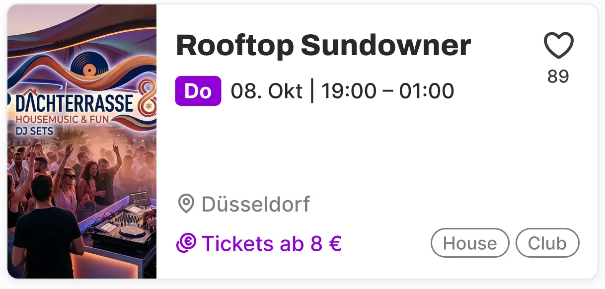
Date: A violet day badge was added. It gives the eye an anchor when people scan the cards.
Distance: The distance wasn’t removed, it’s hidden. It appears as soon as location sharing is on.
Price: The price is highlighted in colour and swapped places with the chips. People can scan the card from top to bottom, and the chips become secondary.
Organiser: Removed from the card, because it doesn’t matter for the decision at this point.
How I would measure the success of the changes
As a next step, I would test the changes with a CRO hypothesis, using KPIs and UX metrics. Taking the CTA button as an example:
- CRO hypothesis: If the button says what happens next (“Tickets kaufen” or “Zur Veranstalterseite”) and the price line also leads to the ticket, more people will move on to the organiser’s page, because they know what to expect.
- KPI task success: Ticket route found on the first try; before 0 of 2, target 4 of 5.
- UX metrics:
- Misclicks and questions before finding the ticket route
- Confidence after the task on a scale of 1 to 5, target at least 4
- Successful if at least 4 of 5 participants find the ticket route on the first try without asking.
Solution & design
Idea and design decisions
For the design, I deliberately adopted familiar patterns from competitor apps and combined them where they made sense. People find their way around straight away, without learning new interaction patterns.
The goal is that people spontaneously get a clear list of all events around them, with a focus on small local ones. That helps on holiday or after a move, when you first have to work out where anything is happening at all. But even people who’ve lived somewhere for years miss a lot, because small events are scattered everywhere, online and offline. According to my research, this mostly affects people between 20 and 39.
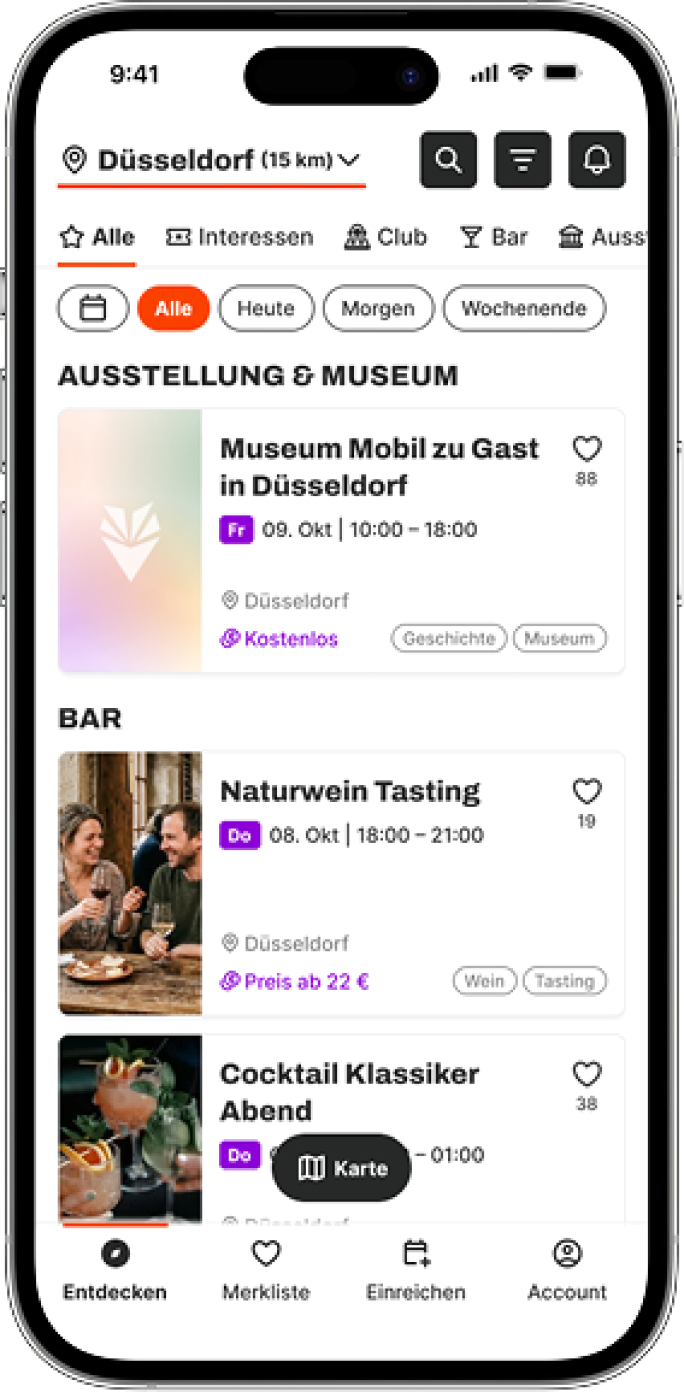
Structure: discover
Top: search + filter
- City picker + radius
- Quick filter (date) + category bar
- Search
- More filters
Bottom: orient + navigate
- Interactive map
- Tab bar
Images · AI-generated
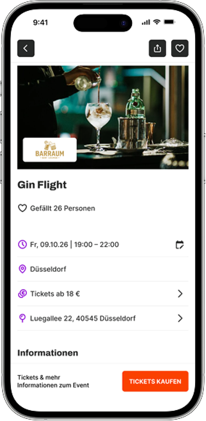
Structure: event details
Top: overview
- Back, share and save stay visible while scrolling
- Event image with the organiser’s logo
- Like count as a popularity signal
- Event details at a glance: date, venue, price and address
Bottom: action
- A short note on what’s behind the button
- CTA button “Tickets kaufen” (buy tickets) or “Zur Veranstalterseite” (to the organiser’s page)
Logo · AI-generated
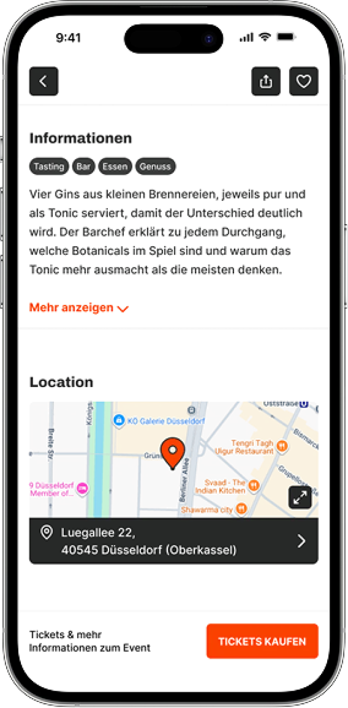
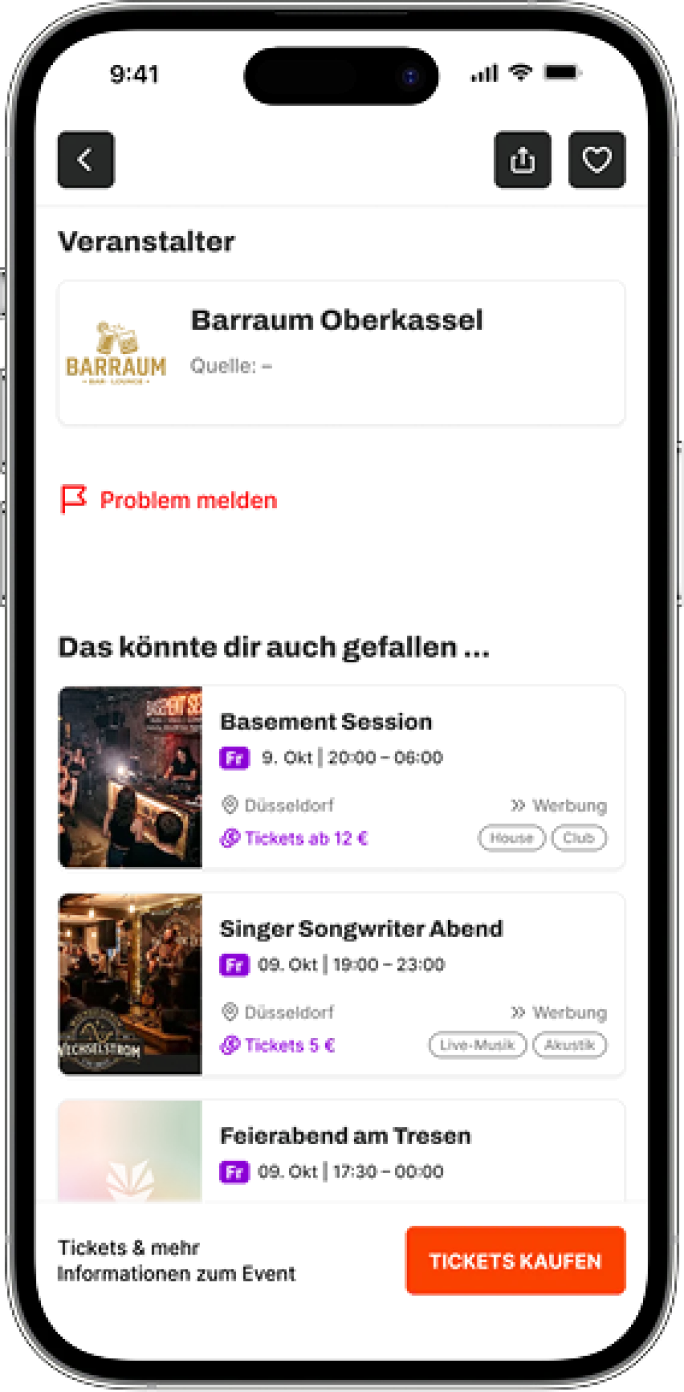
Structure: event details, further down
Left: information and location
- Description with keywords as chips
- “Mehr anzeigen” (show more) expands the full text
- The map can be enlarged
- Tapping the address opens the map app options
Right: organiser and more to discover
- Organiser, with the source named
- Report a problem, for example wrong details
- Similar events as suggestions and ads
Images · AI-generated
Try the prototype in your browser
The clickable prototype will appear here.
What’s included
- Simulated location input (Düsseldorf)
- The MVP’s click paths
- Every tab bar page
- Empty states
Note The prototype isn’t a finished product; it’s the result of my bootcamp and shows the current state of the design process.
How do I measure whether my solution works?
After launch, I would measure success with the HEART framework and also map the metrics onto the AARRR funnel. Both lead to the same two goals:
| Metric | HEART | AARRR | Target | Checked |
|---|---|---|---|---|
| Click rate to the organiser page | Task success | Activation | at least 35 % of detail page views | weekly |
| Return rate | Retention | Retention | at least 25 % within 60 days | monthly |
Learnings & AI
AI as a tool
I ran this project with the help of AI. The tools were Claude (including via MCP in Figma), Claude Code, ChatGPT, Perplexity and Nano Banana.
Research · Perplexity, Claude
I used AI to collect and summarise competitors, market figures and sources. That gave me an overview quickly and left more time for my own analysis. I then checked every figure and claim against the original sources.
Writing & analysis · Claude
Claude pre-sorted interview transcripts, survey results and test notes, and polished the wording of my texts. That saved a lot of writing. The interpretation and prioritisation were my own.
Prototype · Claude with Figma MCP
I handed repetitive work, such as filling in the event cards, to Claude. When something broke, I had it analyse errors in the prototype, and we developed animations together. That let me focus on layout and design decisions.
App content · Nano Banana, Claude
I created event images and logos with Nano Banana, and realistic event data with Claude. That makes the prototype believable without filling every card by hand.
Website · Claude Code
I built my portfolio website with Claude Code. That let me turn my own design into a working site.
Note
AI labels
Every image and logo I created with AI is marked on this website with these tags:
Image · AI-generatedLogo · AI-generatedMy learnings
What worked, what would you do differently?
What worked
- AI saves time, but not thinking. It took research and routine work off my hands, but in the end it stays a supporting tool.
- Participants understood the app without any explanation, precisely because I followed familiar usage patterns (Jakob’s law).
What worked
- AI saves time, but not thinking. It took research and routine work off my hands, but in the end it stays a supporting tool.
- Participants understood the app without any explanation, precisely because I followed familiar usage patterns (Jakob’s law).
Next step
Next, I would check the changes in another usability test. I would also question the notification icon in the header again. Since it’s only a secondary action, it could move into the account area. That makes the header calmer and gives search and filters more room.